White Paint Colors - Benjamin Moore Moonlight White & Vanilla Milkshake

White Paint Colors - Benjamin Moore Moonlight White & Vanilla Milkshake

Hey, all! We're talking paint colors over here. I was happy to share my two favorites last week (literally, I love those colors so much and I hope you use them and love them, too). Today we're tackling the subject of white walls.

You'd think white would be easy, right? But for those of you who have painted anything white, you know that there are no less than four million white colors available. What looks like a simple white can carry undertones of blue, yellow, green, lavender. From a little googling, I can see that when it comes to finding white paint, the struggle is real. Wink.

Read More

DIY Wall Art from Paint Chips

when life hands you paint chips…make art.

or at least that is what someone with borderline hoarding tendencies would say. and that person would be me.

i made this from paint samples, because apparently i can't bear to throw them away. kind of the same reasons for this project. hmmm.

but making this diy paint chip art was a motivating factor for finishing the art wall in our living room because it filled an odd gap in my design. i finished the art wall last year, i think? i can't remember. i had the frames assembled on the floor upstairs for a months before i finally went for it and put some nails in the wall.

this art wall was super fun to assemble, in part because it is a collection of found items with a few fun pieces i've purchased over the years. and most of the frames i already owned, i think. here are some close-ups from left to right, and then i'll tell you stories/sources for each piece.

ok. sources.

1. from the cover of a catalog. // 2. a freebie that came with a print ordered from blancucha on etsy. // 3. lemon yellow citrus birds print from sugarloop on etsy. // 4. love candy print in bubblegum from madebygirl. // 5. a pair of toy spy sunglasses (ben's!) mounted on premier prints chipper slub yellow fabric. // 6. a ribbon from the handle of an anne taylor loft bag. // 7. translucent blue birds print from sugarloop on etsy. // 8. diy paint chip art by me. // 9. a freebie notecard that came with prints ordered from sugarloop on etsy. i wrote in "for freedom Christ has set us free!" which is part of galatians 5:1, a favorite verse.

i guess the point of this story is that frame-able stuff is all around. only three of the nine things on that wall are actual art prints i bought. the rest were freebies that came with those prints or found items. so think outside the box and get creative with all the wonderful bits and bobs around the house!

***i must give credit to emily henderson for her ideas and motivational power. do you watch secrets from a stylist on hgtv? i catch episodes online from time to time, and seeing the composition of art in this episode definitely motivated me to stop procrastinating and just put these pictures up in a freeform, sprawling way. love that show!

a kiss to send us off

things will be quiet around here [the blog] for at least a week while ben and i travel up north for a relaxing week of...nothing. my coworkers asked me what books i planned to take along to the lake and i was embarrassed to admit i hadn't even thought about it. that's not like me at all. no time these days!

i thought i'd leave you with a few shots of our painted bedroom, which happened with the help and support of wes and maggie. pretty boring color—the color of drywall, actually—but i like its simplicity. it is revere pewter by benjamin moore, mixed at sherwin williams (of course!). we branched out and used satin instead of our usual flat. i know, i know, we're crazy!


ben's making a frozen pizza, then we're off to finalize carpet and buy some door knobs. out!

Benjamin Moore Palladian Blue vs. Quiet Moments

ladies and gentlemen! in the right corner, weighing in at 150 pounds, we have quiet moments by benjamin moore (top). don't be surprised by its mellow name. it can pack a punch. in the left corner, weighing in at 160, is palladian blue by benjamin moore (bottom).

palladian blue won with a TKO in the first round. we had it color matched by sherwin williams. it looks great on the walls. quiet moments is down for the count and...we have a winner. ding ding!

art project with miss bef

last night, beth and i completed the second-to-last step of last weekend's art project. the mission was to do something on the walls in the tiny half bath to mimic wallpaper. i've been loving wallpaper lately, as there are tons of modern wallpaper options these days. my favorites are from walnut wallpaper. here are some inspiration photos i've collected.


but wallpaper is expensive, and kind of a commitment. we were in a hurry to finish whatever wall treatment we were going to do because we had to install sconces for our electrical inspection.

now, beth has serious artistic talent so i enlisted her in my art army. i thought we might be able to mimic something natural-looking (like trees) with paint. recently, i saw a design*sponge post with a similar project that encouraged me that we could pull this off. so with these pictures as our inspiration, we set off.


i had already painted the adjoining mudroom in "dorian gray" by sherwin williams, so we carried that into the bathroom, too. (of course, i had a semi-brief period in which i was convinced we should paint this bathroom bright kelly green...but i realized the error of my ways. but i guarantee green will appear throughout our home...i love it!)

beth just sketched some tree outlines in pencil right onto the wall. then we filled them in. i initially bought the shade of white that was at the top of the paint sample strip, but when we put it on the wall, it was too stark (i think it was four shades away). we went back and bought the shade right next to dorian. after a few hours of painting last friday, beth finished up the details last night with a small brush. here she is in action:


and here are a few shots of the bigger picture. (we only painted the tree silhouettes on one wall - the one that is visible from the mudroom.)


in morning light (and with the green tape removed):


i am really pleased with the results. we need to do a few touch-ups, but it is pretty much finished. once we get the window painted white, some trim, a toilet and sink, and a few accessories, i think it will look really sharp.

thanks for your help, beth! now i'm off to tile the floor for the mudroom and bath. pics to come!

weekend update: mini-makeovers

this past weekend was full of small triumphs around the house.

first off: the front porch. i finally put out the housewarming gift dave and lauren got us. it is an adorable welcome mat from patina. my mom and i went to costco and she bought us this fantasticly huge plant. so they went up on the front porch. i know this is kind of like lipstick on a pig, but it brightened up our entryway significantly (even if the only person who notices is the postman).

before:


after:

to quote from clueless, "not a totally betty, but a vast improvement."

here's another small update:


(please excuse the sawdust.) i love the knobs. they add a great sheen to the kitchen that makes me really excited for shiny new appliances.

and finally, we painted the mudroom a lovely shade of gray. it was actually called "dorian gray" from sherwin williams. they had funny names. a close shade was even called "intellectual gray." i want that job: naming paint colors. we also installed a light fixture because we have our final electrical inspection coming up. we decided that the fixture wasn't bright enough, but we'll keep it up for the inspection and then change it out.

before (note the sad little light bulb):


after (note the sad lack of doorknob):


i think it will look awesome with crisp white trim. the doors will be painted a color to keep them from looking filthy; i'm just not quite sure which color yet.

this weekend involves a paint project in the half bath with a special guest. i'll post pics when it is finished!

the finishing touches

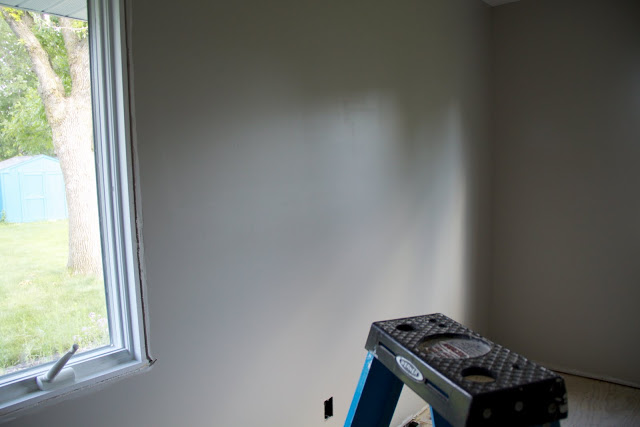
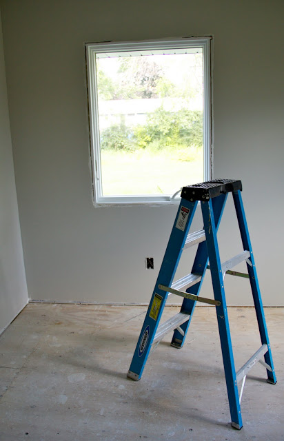
we got our sliding glass door and windows installed yesterday. what a huge difference! but because i can't find my camera at the moment, this post is going to be about things on the internet. :)

the last few weeks have been a whirlwind of things to pick out. to be honest, sometimes i suffer from the problem of too many options. i second-guess myself and wonder if there is something out there i would like better. so ben has been reassuring me that we are making the right choices.

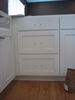
here's what we went with for cabinet hardware. the cup pulls are for the drawers. i like how they are kind of old-fashioned in style, but with an updated finish. they are sturdy, too! the knobs are super basic. nothing fancy.
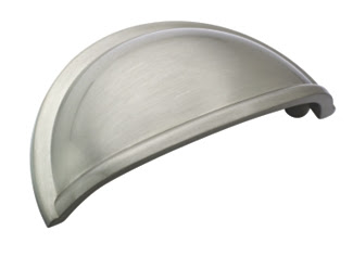
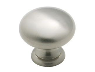
ben likes the oil-rubbed bronze finish on knobs, but i like anything silvery. we compromised and decided to get oil-rubbed hardware for the front door. i feel like every decision we make reminds me of how different our tastes are. but he's been really easy to work with on this. it's been a blessing.

hmmm...what else. we picked out our kitchen sink last night! after i stalled for weeks and weeks, we finally just went and bought one at home depot. one thing ben and i could agree on was that we both love apron sinks, like this:

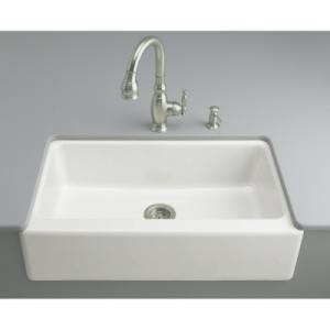
i was so excited that we agreed! however, the more we researched, we found out that they are kind of risky. first, they are super expensive. the one above is like $1,150. second, you have to have a special under-sink cabinet made, and your countertops are also designed around the sink shape. apparently, no two apron sinks are exactly the same, so it posed a problem if anything were to happen to the original. (i have been trying to think worst-case scenario for all these decisions: what happens if it breaks, etc.) so the apron sink was out.

i personally like the undermount sink, but ben vetoed those. so, we consulted consumer reports (which we have been using a lot lately, and i highly recommend!) and found that cast-iron, enamel sinks are highly rated. so that is what we got. they are a standard size, so easy to replace if need be. i wanted one big sink, but my mom and mom-in-law convinced me that i would want a sink with a divider. so when i saw this one at home depot with a low divider for soaking pans, i was sold.

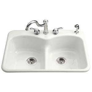
it's simple. nothing special, but i think we'll be happy with it. at 10% off and $225, it was a good value.

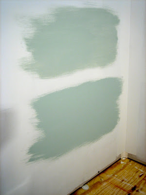
finally, we picked out our paint for the kitchen. this is a really big deal. ben doesn't like the all-white kitchens that i do, so with white cabinets and white countertops already ordered, we needed something with a lot of contrast. i'm not gonna say what color it is until i post pictures, but it satisfies my need for something graphic and crisp, and hopefully ben's desire for something warm (not a sterile, modern kitchen).

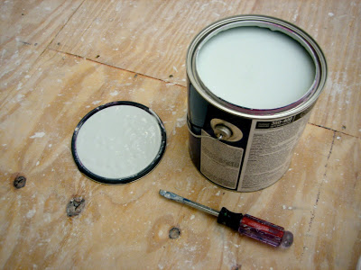
i did get a sample of it last night and painted a few patches on the walls. i wanted to see what it looked like in natural light and at different times of the day. it looked a little light in the bucket, but when it dried, i was totally sold. ben is happy, too, so i'm happy.

so tonight, we prime the walls. then, this weekend, we paint!