A Whole-House Color Palette: Lessons Learned
/
We have had a beautiful spring here in Minnesota! What a gift from God. Does anyone else get the itch to rearrange the house and freshen up this time of year? With the sun streaming in the windows and the weather changing outside, it feels right to me to change things up inside, too.
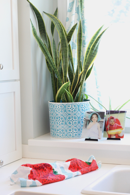
Some of the rearranging was necessary because my potted palm had grown so well it had become too big for my kitchen window! But where to put it? As I moved some items around, I realized something about our home that I really like and I wanted to share it as a Lesson Learned.
Lesson Learned: A unified, whole-house color palette makes rearranging easy (and saves you money!).
I bet a lot of you do this already, maybe without even knowing it. Chances are, you naturally gravitate toward certain colors for your home. Maybe you prefer warm colors or cool colors or neutrals or metallics. You probably already have a lot of the same colors flowing through your home—especially if you have an open-concept house, where the living, dining, and kitchen spaces are open to each other and share common walls without a change in paint color.
Today, I have a fairly defined whole-house color palette. If you'd like to see the big picture of what I'm talking about, check out our home tour! But I didn't always have this. I would approach each room separately in terms of colors, not really thinking about the colors in the adjacent rooms or colors I already had in my house.
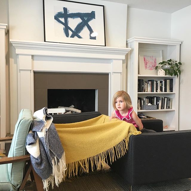
But somewhere along the way, it happened. I think it started as I became a little more disciplined about what styles I appreciate in general versus what I like for my own home. I began to hone in on certain colors or combinations of colors. As I made mistakes about wall colors, I also learned what I do like and eventually painted separate rooms in my house the same color because I like it so much. So today, the whole-house color palette is loosely there. Not every room has all the colors, but in general, you'll see lots of turquoise, red, pink, and white with hints of yellow, purple, other shades of blue, wood tones, and green plants. I'm a cool-color gal who loves her white!
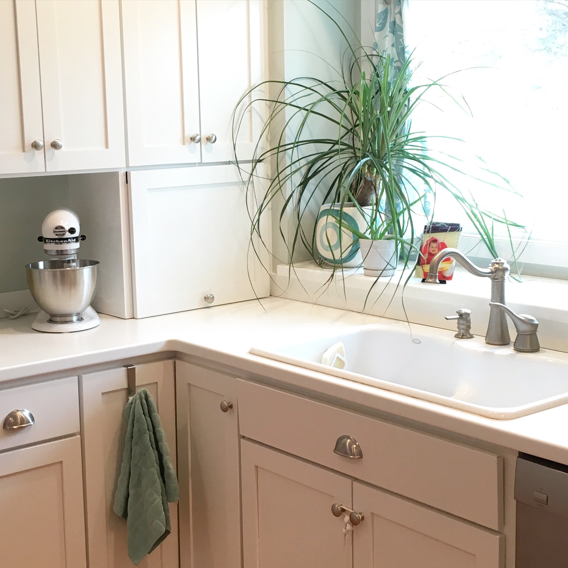
And here's the beauty of having a whole-house color palette: when you feel the need to refresh your spaces, you can get that fix without spending a dime. You can rework what you already have to make it feel new because the things you already own can work together in numerous ways. For example, I moved that potted palm from the kitchen to our bedroom and reworked our dresser. Check out the before and after.

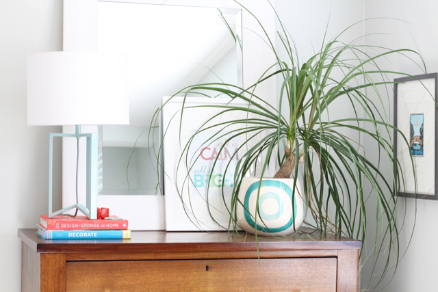
So much more light! And doesn't the dresser top look better with a green plant? Life!
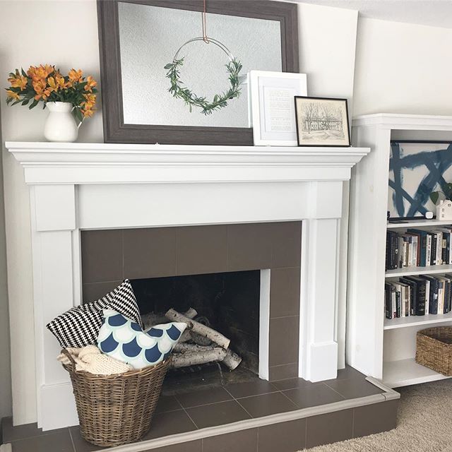
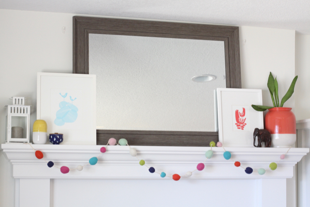
Now, not every room has to have the exact same colors for this to work, but generally, having similar colors will make this a success. When I reworked the bedroom dresser, I borrowed a print from the living room mantel. The colors work there, and the colors work here. The pickle can be what to put in the place of what you have taken, but this time, it all worked out! I had another planter with similar colors that I could put in the kitchen window where the palm was, and I had another piece of art that fits in seamlessly on the mantel—again, because the colors in our house are consistent.
See how that works? And I felt fabulous—I rearranged to get that feeling of newness but didn't spend any money. It feels so great to use what you have. Oh! And I have one last trick I want to share on this point. As you land on your own color palette, try your best to branch out past solids or two-color patterns. Look for items that have ALL or MOST of your palette's colors in them. Those items will really tie together your vignettes!
In our house, a few of these items are the geometric pillow in our bedroom, the art above the bedroom chair, and the pom-pom garland on the mantel. Look back at the picture of the mantel—I have mostly solids up there, but the multicolor garland brings in that variety to make it look interesting.

Take a walk through your rooms. Do you have a pretty consistent palette throughout your house? Are you still on your way to developing your own color preferences? What questions do you have for me? Let me know in the comments!