My Two Favorite Paint Colors in Our Home
/We had friends over for dinner on Tuesday night, and I was smiling as Ben told them his painting policy for me: he will help me paint a room the first time, but if I want to repaint, that work is up to me. I hope that doesn't come across as harsh, because it's not. He is so patient and knows that paint-color mistakes happen (and he even encouraged me to repaint our bedroom because he knew it wasn't right). But his policy helps keep me from being too fickle. It encourages me to be thoughtful, intentional, and working toward my home goals with the big picture in mind. It is a lot of work to paint a room alone (not to mention the costs of repainting often can add up!). So it makes me think and think again before going ahead with it.
Through lots of trial and error, I have landed on two love love LOVE paint colors in our home. I want to share them in case you are in the market for a good, tried-and-true color (that happens to be in the aqua category, wink!). When thinking about colors, I've done my fair share of googling, so I hope my experiences helpfully contribute to the color conversation and help you find colors you love.
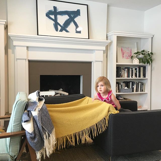
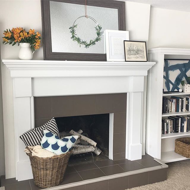
1. BENJAMIN MOORE PALLADIAN BLUE
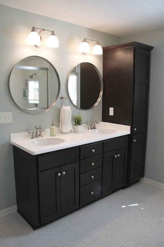
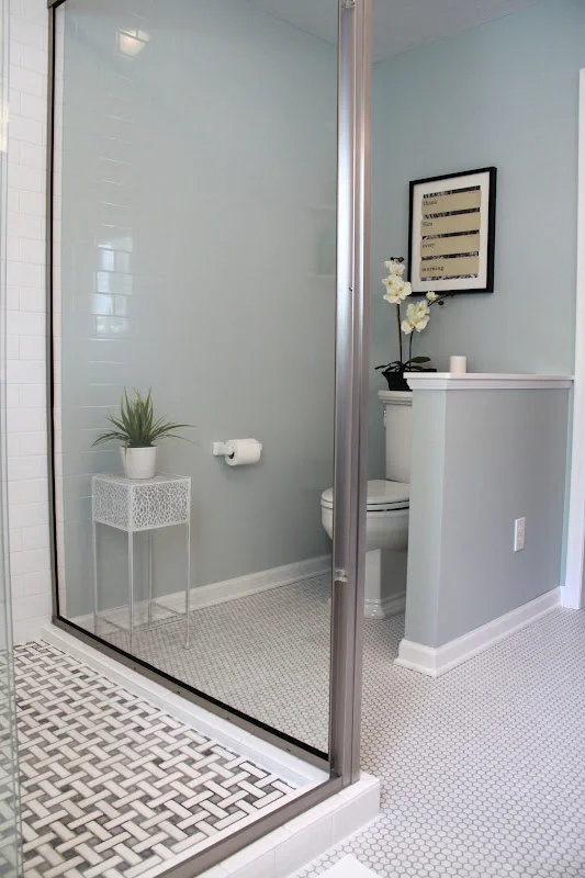
We first used Palladian Blue in our master bathroom. The color is just lovely against white trim. It is such a gorgeous blue/gray/green and I can imagine it being used successfully in many different types of spaces. It's one of those chameleon colors that can look different depending on the light, time of day, and what it is paired with. You know how for a while all the HGTV shows talked about making bathrooms “soothing" and “spa-like"? Yup. This color is both those things.
When we renovated our master bathroom in 2010, I remember being so influenced by Stefanie's master bathroom. She used Quiet Moments by Benjamin Moore on her walls, but when I was in the store, Palladian Blue caught my eye so I put up samples next to each other. Quiet Moments is on top.
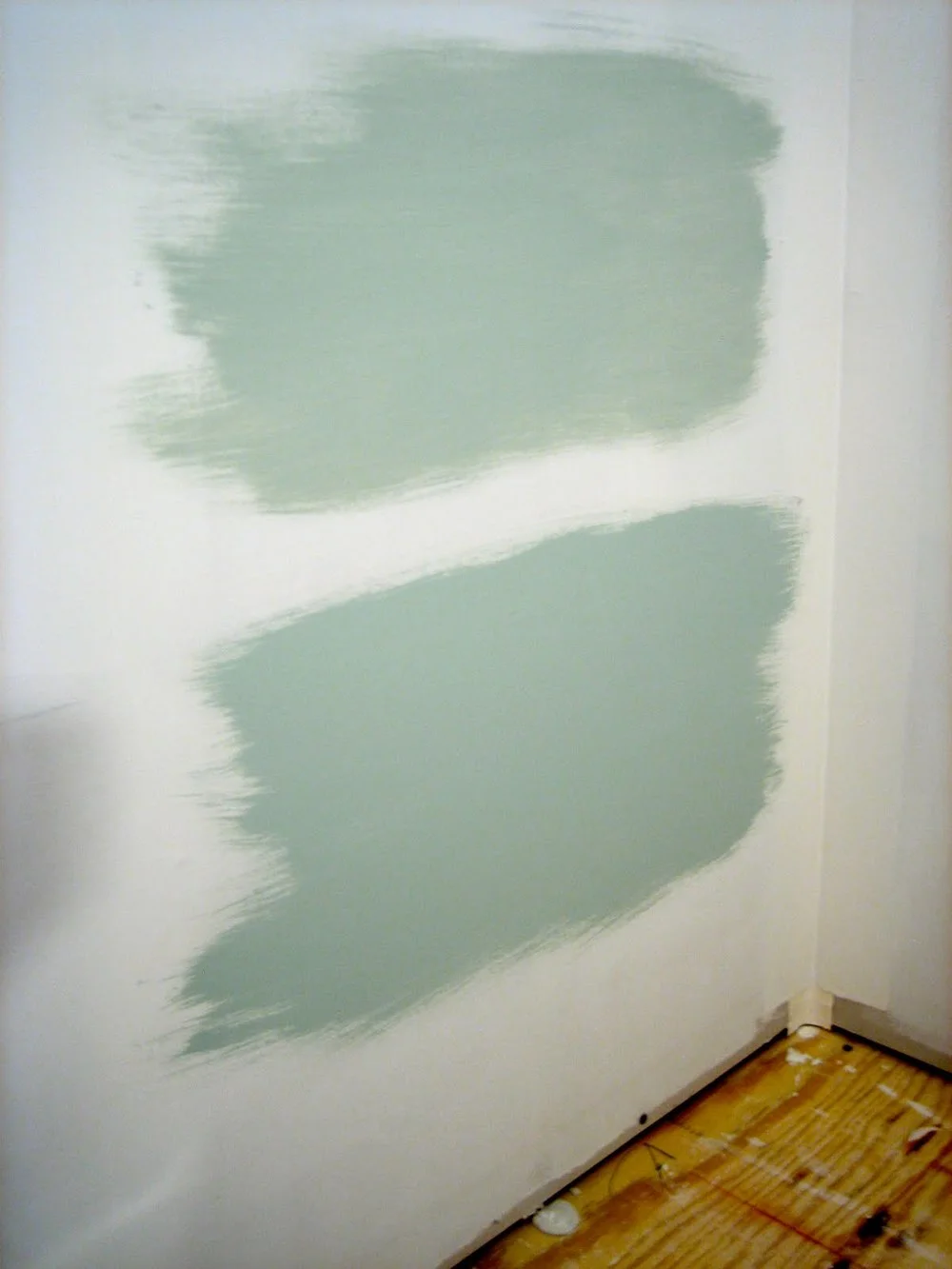
They are both gorgeous colors, but Palladian Blue has a little more oomph to it, a touch more color. And we've loved it in our master so much we reused it in the girls' shared bath when we renovated that in 2012. These images from our master bathroom make the color look a little bluer than it really is, I think. It does have some green in it. It is not a powder blue.
2. BENJAMIN MOORE HEALING ALOE
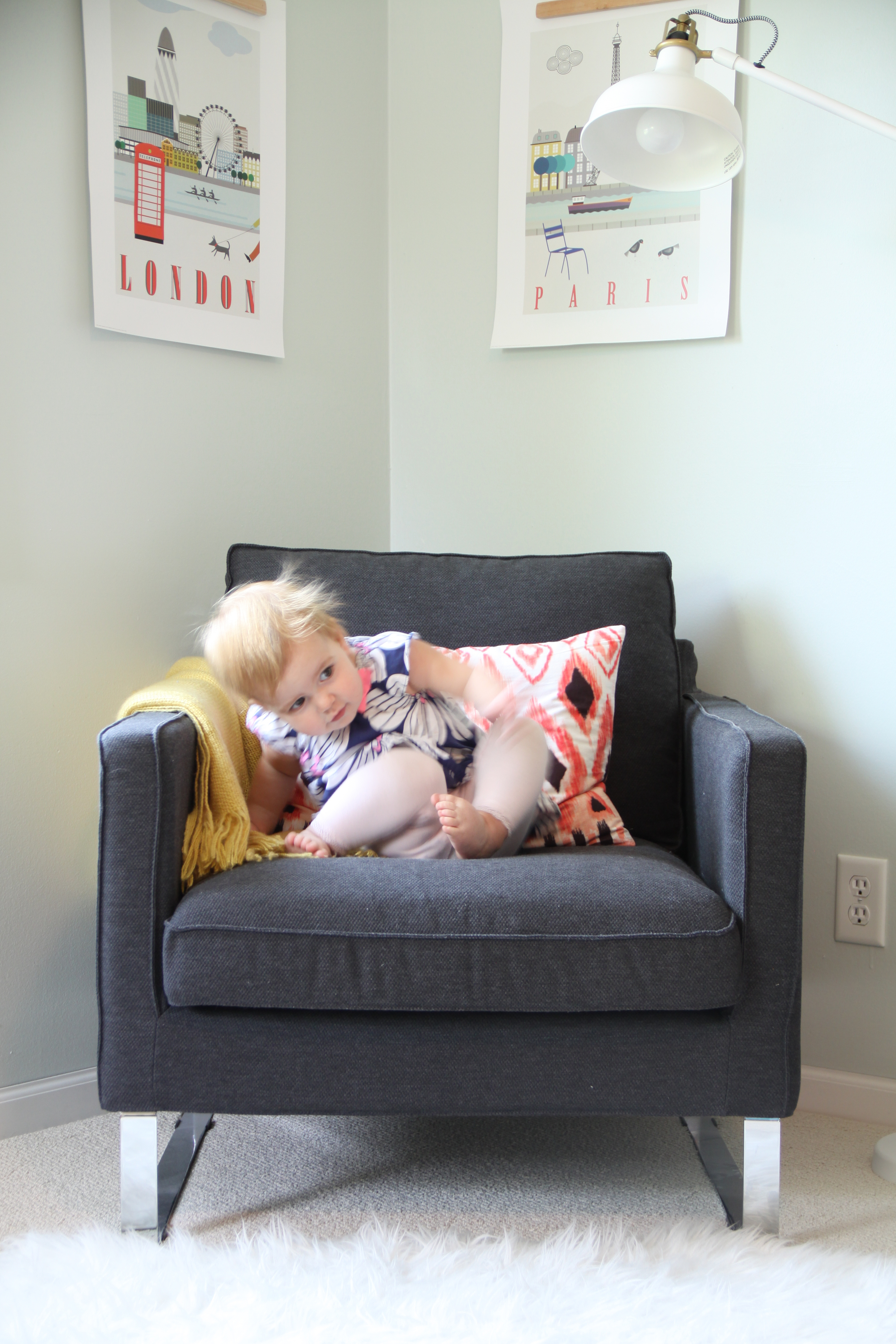
Yes, yes, yes. We stumbled upon this versatile color on a whim—we were renovating the two upstairs bedrooms in 2012, and I knew I wanted the nursery to be white. But what color to paint the other bedroom? Ben's vote was for not white. We needed something versatile, something that could work for a girl or boy (this was before girl #2 was born). I had a lot of color chips and Healing Aloe won out somehow. And I am very glad it did. We love it so much we now have it in three spaces in our home.
First, that initial upstairs bedroom, which is now our older daughter's bedroom. (Here is little sister.)
Love it in there. Second, our kitchen, which used to be dark brown! When it inevitably came time to lighten up, I knew Healing Aloe was a winner so we went for it. And since it was a repaint, I tackled it myself when Ben was out of town. But I didn't really do it alone because my dear friend Beth came over to help me!
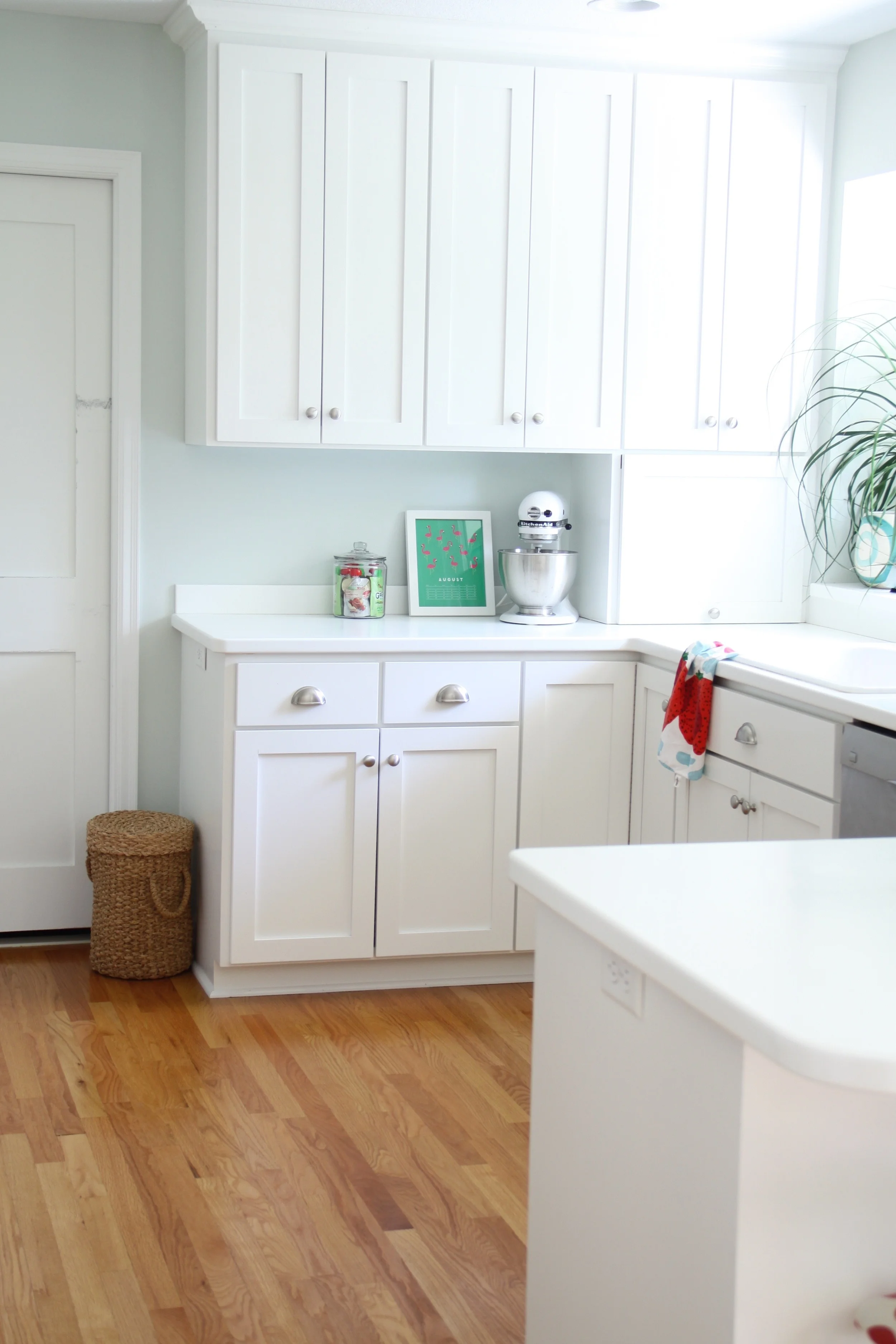
Putting Healing Aloe in our kitchen was a bit of a compromise for us, because I would have painted the walls white but again, Ben voted for not white walls. And his vote counts. He lives here, too! But really, I love this color so the compromise was really nothing.
I would recommend Healing Aloe if you love the look of white walls but don't really want white walls. Does that even make sense? Healing Aloe has a paleness to it but a bit of color to keep a space from being too stark, if that is what you fear about white walls. It looks gorgeous with true whites, but colors pop off it beautifully, too.
Finally, we used Healing Aloe in our master bedroom. This was another room where I got it wrong the first time (it was initially Benjamin Moore Revere Pewter, which was a nice gray but not right in here). So we slept in the living room for a night and I worked hard to repaint this room in Healing Aloe.
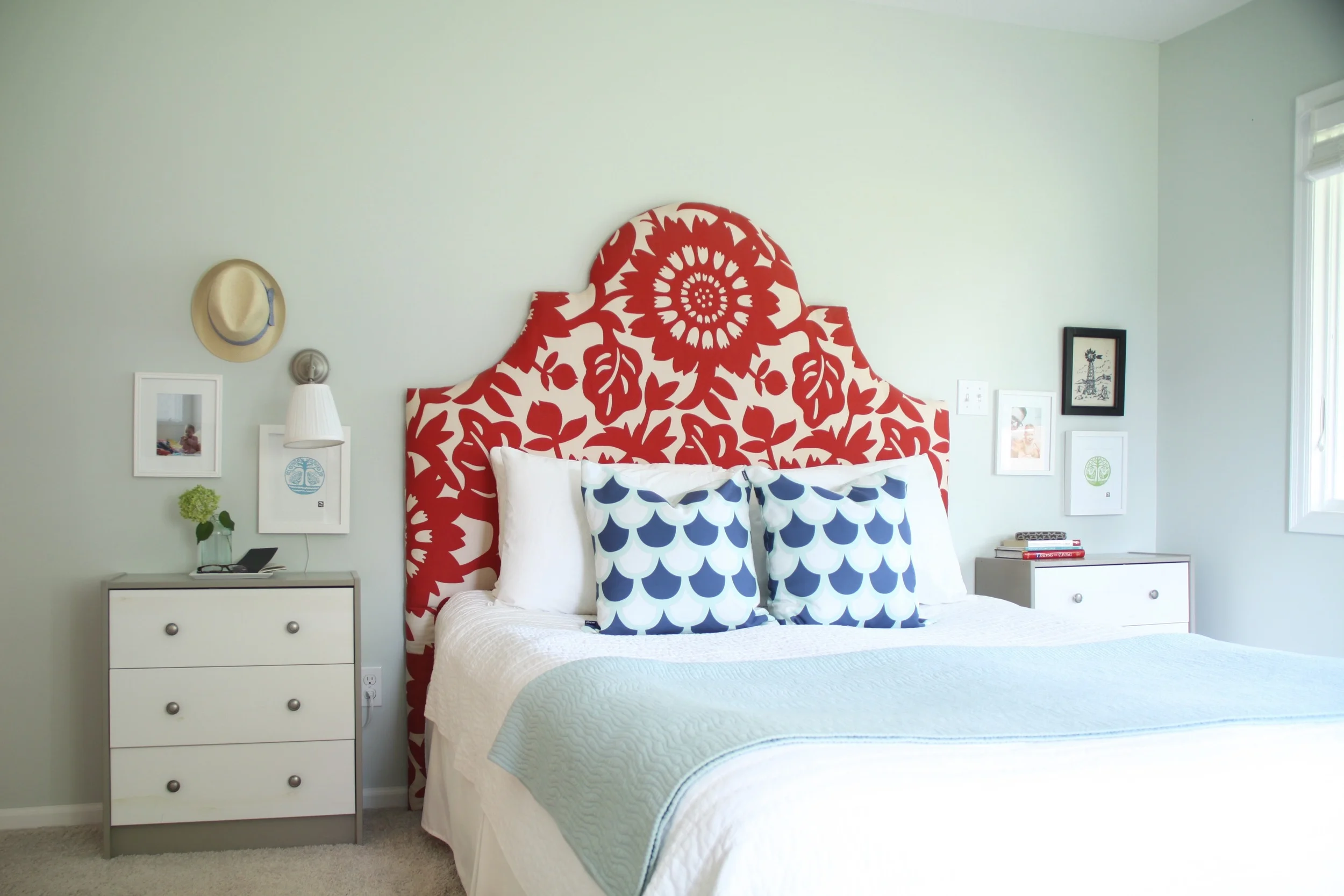
This room is adjacent to a bathroom with Palladian Blue walls, and the two colors complement each other nicely. They are extremely similar in blue/gray/green tones, but Healing Aloe is much more pale. If you like one, you'll probably like the other. (Psssst. Wanna see Healing Aloe in a different home? Check out this gorgeousness—and on the builder's page, too.)
I am certainly not afraid to reuse a paint color in multiple spaces in my home. In fact, I think it feels so nice to know for sure that you like a color and try it elsewhere, knowing you likely won't be disappointed because you know what to expect.
Guys, come visit next week, because I want to continue the paint color conversation and talk about white walls. A good white is hard to come by, so I hope that sharing this information helps you see how a color looks in a real-life home. Enjoy your weekend! Will anybody be painting? ;)